Lunchtime Game Review
Simplicity is difficult. The majority of that struggle comes down to letting go of something you think is a good idea, but is just adding complexity to the format you are working in i.e overthinking it. Logos live or die on their readability and suitability for use on a variety of background colours and formats; meaning limited, good, choices of fonts, colours and shapes. All very straight forward to understand when you are looking at one, but try telling your left-hemisphere that when it wants to show off to you just how creative it can be!
When some Leamington based pals of mine started putting together this little gem of a Youtube channel, I jumped on board to assist with some logo design work to brand it with. It was a fresh reminder of just how challenging simplicity can be.
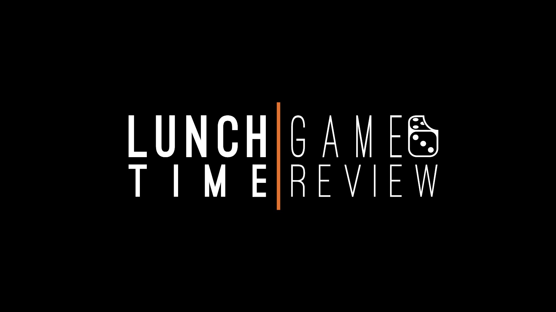
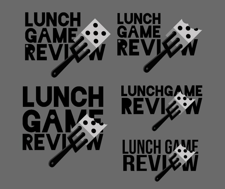
Starting out, I really latched onto this idea of the “E” in review being a fork stuck into the number 3 side of the dice (sketches to the right). It was something that seemed like a lot of fun and a clever little motif, but just couldn’t be made to work in manner that would match the clean, modern, sleek cinematography of their content. I’m not exaggerating when I say it took me the best part of a day to let go of this idea.
After a break, with some fresh perspective, I kept hold of the bitten dice, chose a welcoming sans-serif font and introduced an orange line in the middle to separate the words (if you appreciate the art-school justification: this brings to mind time and appetite found in the middle of the day).
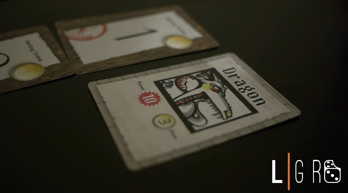
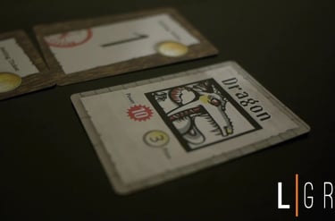
I also designed a contracted form of the logo that can be used as a digital on-screen-graphic or branding wherever the long form will be illegible or take up too much space.

It has been a good while since I last did some logo work, especially for something that wasn’t relying on just solely my own artistic direction or a pre-existing brand style guide like GrubRunner or Merlin. It is certainly an art form I am in awe of and hope to continue if only as an exercise in refining my creative process (I tend to be an over thinker!).
Though I may continue to refinine and shape the branding as the channel evolves, we are all happy with the result so far. Check out their second video below, with my logo included; it’ll make you chuckle and maybe inspire a lunchtime game or two, too!